Teams and Advertising websites
Brand strategy and execution for Stack Overflow’s paid products.
- Date
- 10/2023
- At
- Stack Overflow

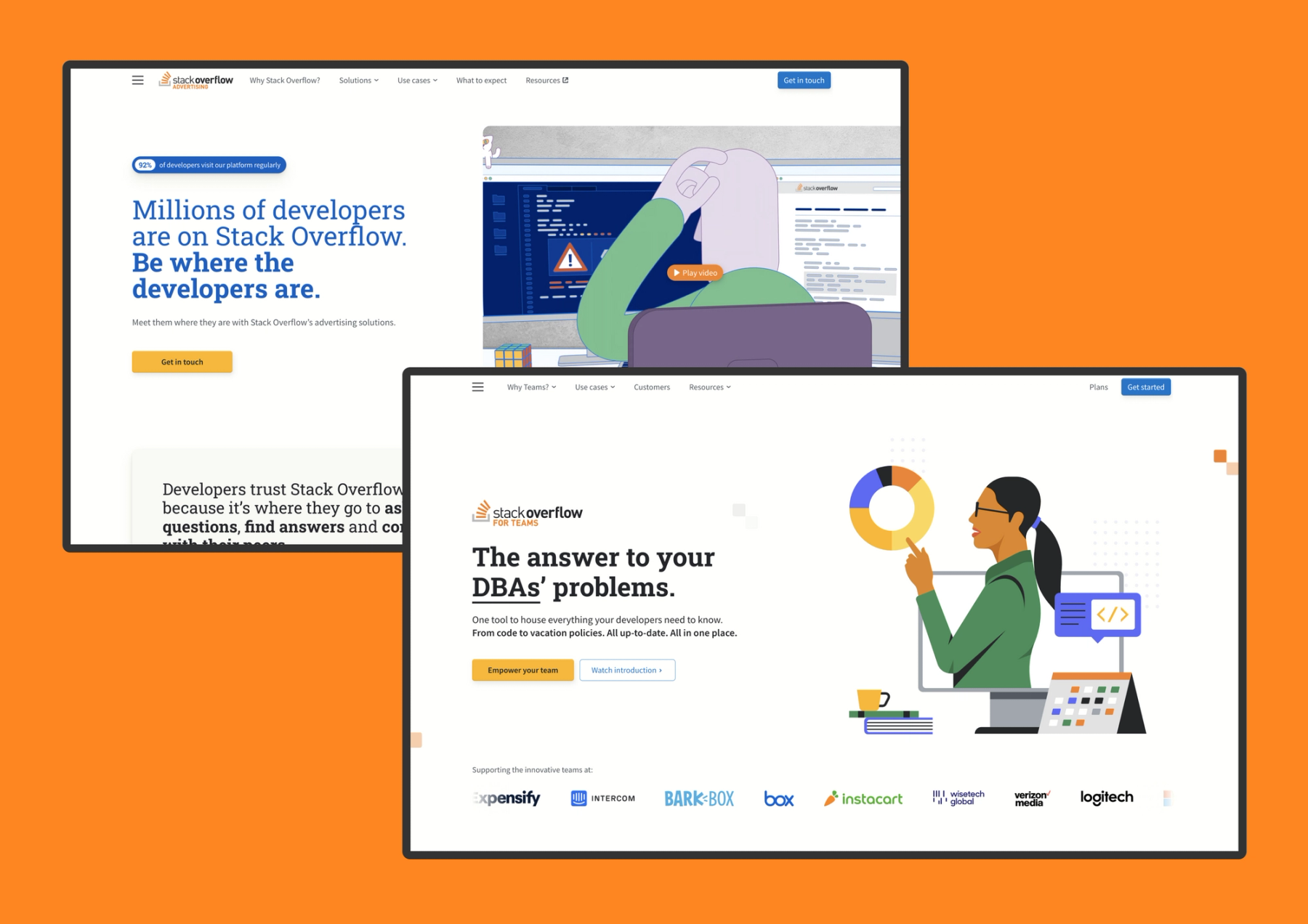
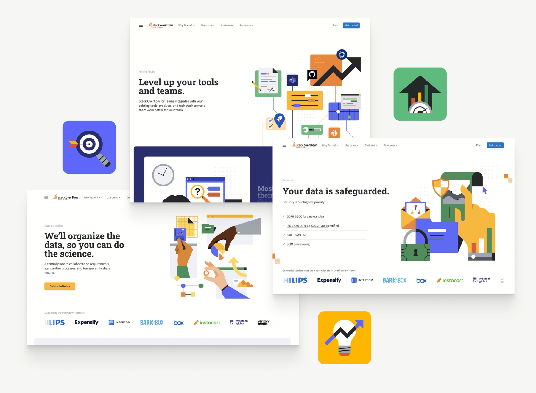
Leading the brand studio at Stack Overflow, I am lucky enough to work with multidisciplinary designer Jake Rochford on a rebrand and redesign our paid products into a unified, modern aesthetic and tone.
As with any large projetct, stakeholder management was key to balance the many competing priorities and points of view. I like to begin with brand workshops and a wireframing exercise to literally get the team on the same page and determine the most appropriate visual hierarchy, splitting the conversation between content and presentation.
We recruited two talented freelancers to help us - Julia McCloy Steffen for content design and copywriting and Tristan Kromopawiro for illustration. Both brought their own ideas and expertice to the project.

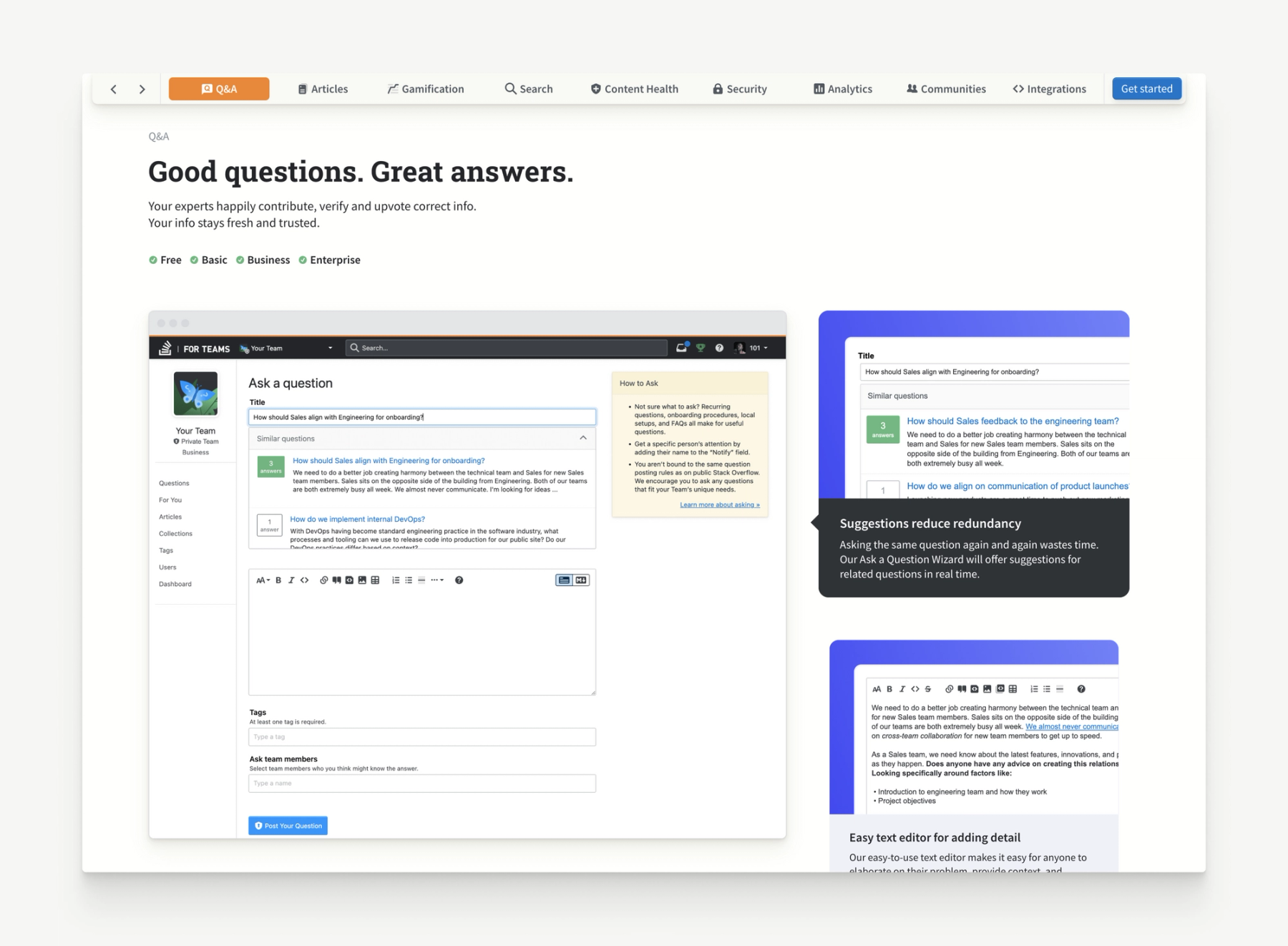
The sites were all built by me in Nuxt 3 so we could create richer experiences than previously possible for Stack Overflow, using tools GSAP (see more about the platform update from the legacy monolith setup). This included an custom made automated in-product screenshot tool so maintaining current product imagery is a breeze.

The platform and redesign continue to deliver results, including over doubling our conversation rate for Stack Overflow for Teams.
“Last week was a big week for inbound contact form fills from our new website. We saw our best week ever for SALs [Sales-Accepted Leads] from organic contact form fills, which historically has been our top source for qualified pipeline. The main contributor to the lift was our site’s conversion rate growing more than 2x.” – Prashanth Chandresakar, CEO of Stack Overflow
Other highlights include boosting the Advertising conversation rate from 1.8% to 2.5%, with some pages as high as 4.8%.
Thank you to Jake Rochford for providing the animations on this page.